AI画像生成 : 日本画風アラカルト
2025/10/05
- ~ index ~
- 概要
- 日本画とは?
- 日本画プロンプトアラカルト
- 「コスモスと女性」・「バラ園にて」
- 日本画とアニメーション
- 最終作品と評価
- 感想
概要
ChatGPTとのチャットを繰り返しているうちにGoogle Whiskが " 印象派や浮世絵、日本画風のように、輪郭線を控えめにして色面で形を描く表現が得意" とChatGPTは述べていた。
AIによるデジタルアートでどれだけ日本画に近づけるかを様々な角度からアプローチしてみる。
Google Whiskは 多目的AIであるGeminiの 画像生成機能を基盤としたアプリケーションである。
当ページは、大きくなりすぎたものを2ページに分けたものです。
著名な日本画家風の生成画像
日本画とは?
1878年(明治11年、当時25歳)アメリカ合衆国から来日し、東京帝国大学で哲学などを教えたアーネスト・フェノロサは次のように述べている。
フェノロサが日本の美術に強い関心を示し、評価したことは有名である。フェノロサが1882年に龍池会で行った講演『美術真説』で使った Japanese painting の翻訳が「日本画」という言葉の初出である。
この講演でフェノロサは次のような点を日本画の特徴として挙げ、優れたところと評価している。
-
写真のような写実を追わない。
陰影が無い。
鉤勒(こうろく、輪郭線)がある。
色調が濃厚でない。
表現が簡潔である。
フェノロサの通訳を勤めており助手であった岡倉覚三(のちの天心)らはこれに大きく力づけられ、1889年に東京美術学校(後の東京藝術大学)を開くと、西洋画の教育を排し、絵画としては橋本雅邦らを教師として日本画科をのみ設けた。第1期生には横山大観らがいる。(wikipedia)
日本画の色調は濃厚でない、つまり淡いというイメージがありますが?
1. 日本画の「淡い色調」というイメージの背景

日本画というと「やわらかい」「くすんだ」「静かな」色合いを連想しがちですが、これは特に平安・鎌倉期の仏画や絵巻物の経年による褪色
江戸後期から明治期の写生画や近代日本画の中で、水分を多く含んだ薄塗り(たらし込み・にじみ)を用いた作品の印象によるところが大きいです。

近代に活躍した横山大観や菱田春草らは、空気感や遠近感を出すために淡彩を好みました。
そのため「日本画=淡い」というイメージが定着しました。

2. 岩絵具の特性
日本画に用いられる岩絵具(がんえのぐ)は、鉱物を砕き粒子状にしたものです。

主な特徴は次の通りです:
粒子が大きいほど光を強く反射し、発色は鮮やかで華やか。
粒子が細かいほど透けるように沈み込み、柔らかく落ち着いた発色になる。
膠(にかわ)で紙や絹に定着させるため、油絵のような深い艶は出にくく、マットで落ち着いた質感を保つ。
つまり、同じ岩絵具でも、粒子の大きさと塗り方によって、淡彩からきらびやかな彩色まで幅広く表現可能です。

「岩絵具」とは
日本画で使われる絵具は、洋画のようなチューブ絵具ではなく、天然の鉱石や貝殻などを砕いた粉末絵具です。
代表的な原料は:
青:ラピスラズリ(群青)
緑:孔雀石(マラカイト)
赤:辰砂(しんしゃ)や紅殻
白:胡粉(貝殻の粉)

岩絵の具カラーコード

これらを膠(にかわ:動物の皮や骨から作る接着剤)で溶いて使います。

3. 鮮やかな色調をもつ代表的な日本画作品
狩野派・琳派の作品
金箔地に群青や緑青、朱をはっきりと置き、非常に鮮やかな色彩です。岩絵具を用いています。

伊藤若冲《動植綵絵》
群青、緑青、辰砂など、天然鉱物を用いた鮮やかな発色が特徴。

近代以降の作品
竹内栖鳳、上村松園、東山魁夷なども、重要な場面やモチーフに濃い群青・緋色・緑青を用いています。

4. なぜ淡彩の印象が残るのか
岩絵具自体は鮮やかでも、日本画は余白(空間)を重視し、画面全体を均一に塗り込めることが少ないため、西洋油彩画のような全面的な強い発色にはなりません。
さらに、岩絵具は経年変化でやや色が落ち着き、古い作品では淡く見えることが多いです。

✅ まとめ
鮮やかな日本画は岩絵具をしっかり用いている。
淡い色調は日本画の「特徴」というよりも、様式や時代・画家の表現の傾向によるもの。
岩絵具は粒子の大きさと塗り方で淡彩にも鮮彩にも対応できる素材です。
日本画=淡い色、と決めつけるのは誤解であり、琳派や若冲のように非常に鮮やかな色彩美も日本画の重要な伝統です。
日本画プロンプトアラカルト
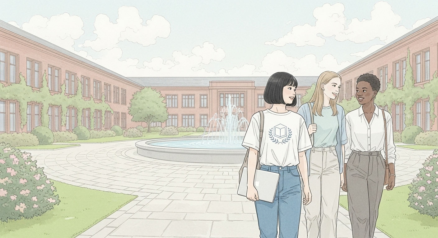
日本画風な画像のプロンプトをChatGPTで作り、Google Whiskで画像生成すると、出来上がったものは自分が思っていた日本画とは若干異なり、むしろアニメ調に見える。
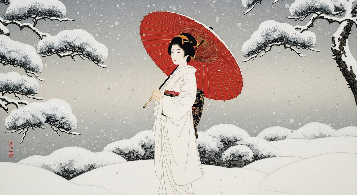
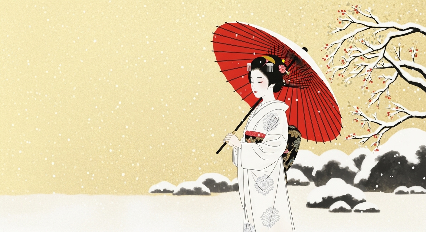
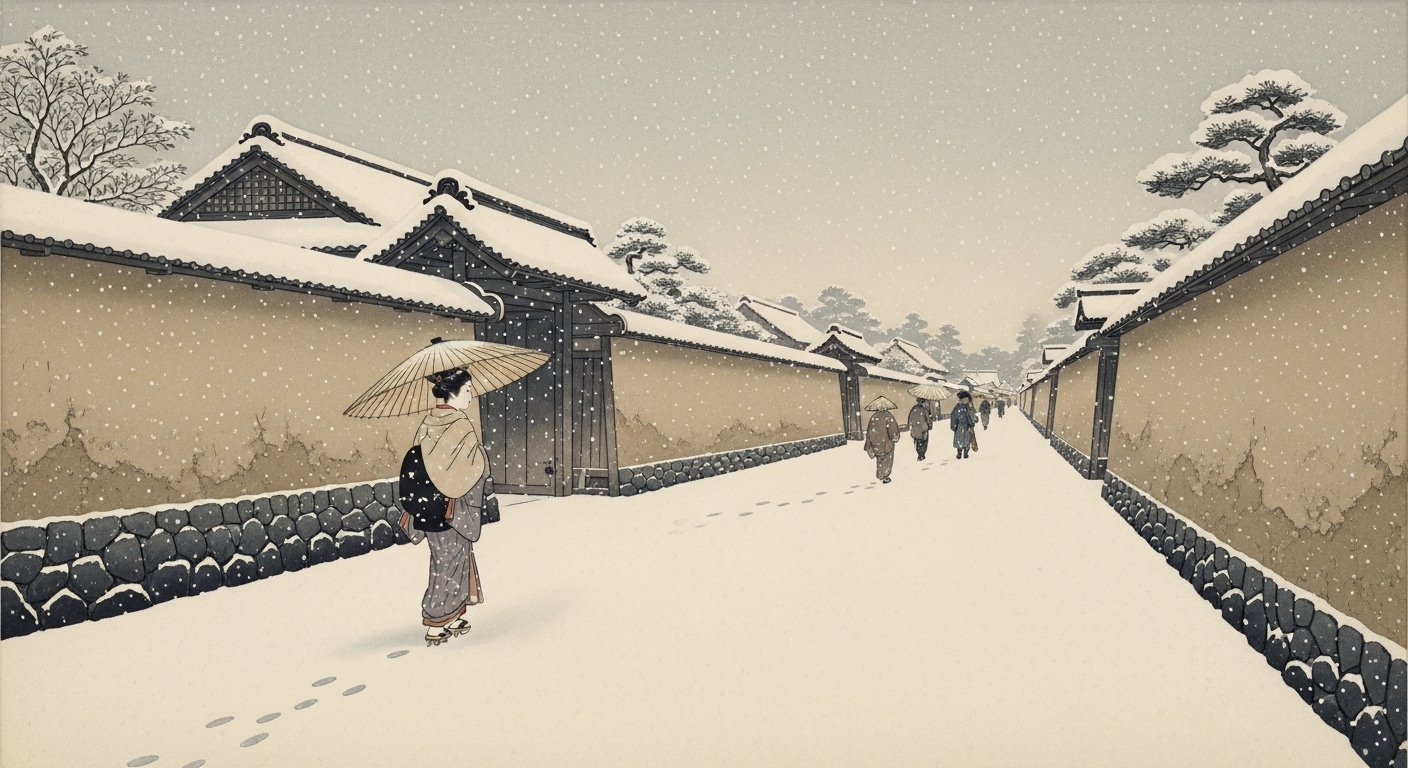
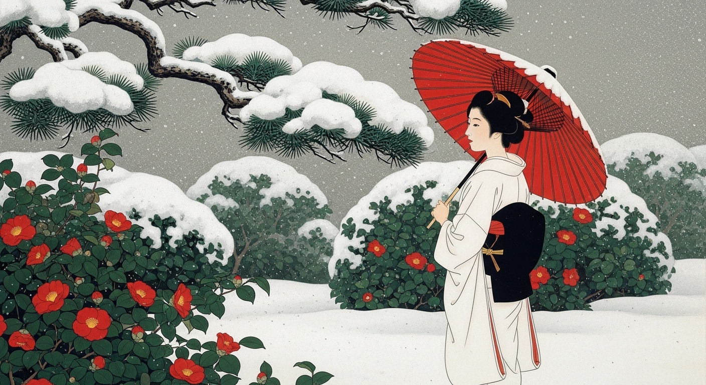
以下の画像は、基本は日本画としてプロンプトしたもの。

敢えて、日本的なものから離れてアメリカの伝統ある大学に留学している日本人留学生を題材として取り上げた。
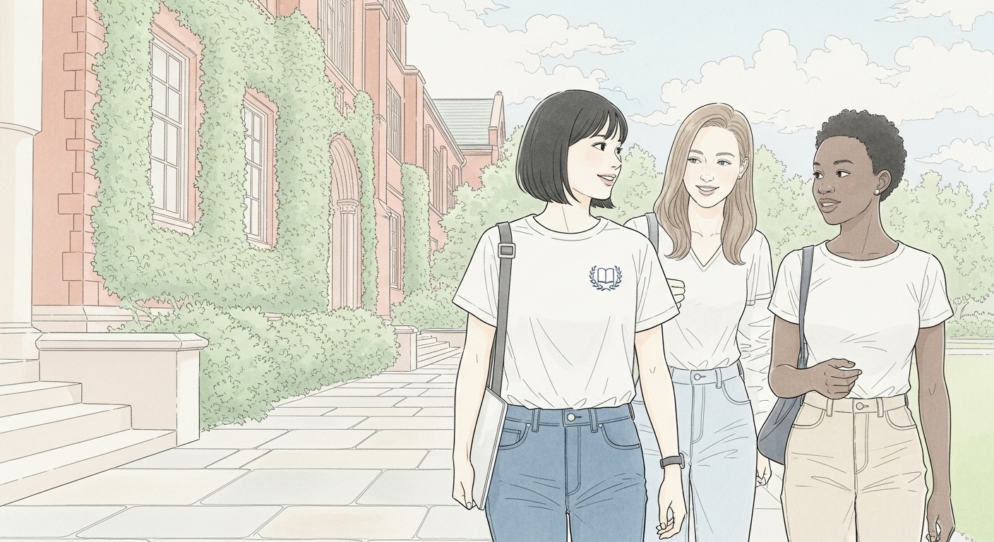

上記のような外国の題材で、著名な日本画の作者風な画像を生成させたがどうしても日本画風の切れ長の目の女性にはならなかった。アニメ風だが画像としては悪くない。
プロンプト例
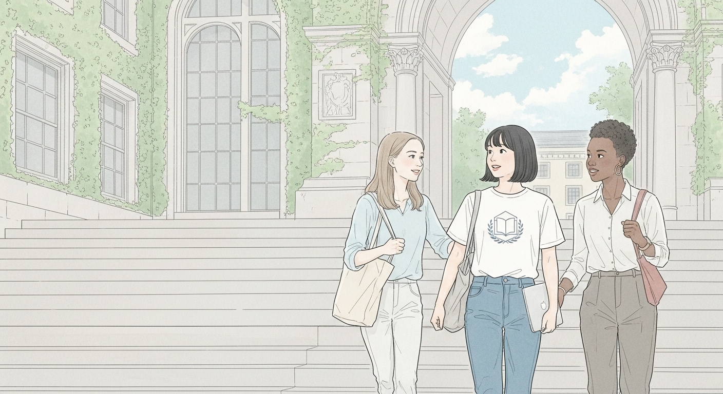
輪郭線を抑えたプロンプトを試してみる。
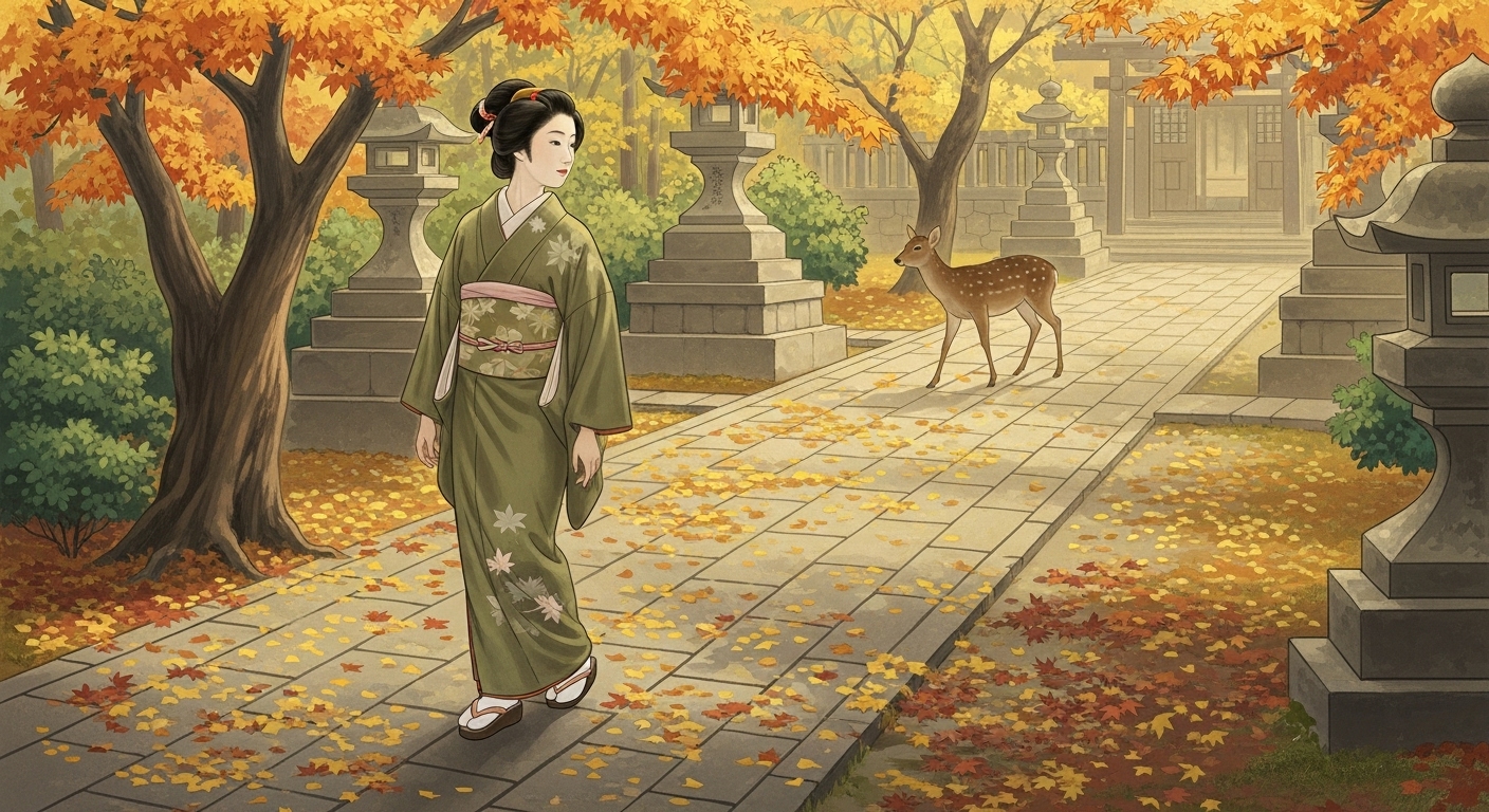
プロンプト①:
A refined Japanese Nihonga-style painting created on soft handmade washi paper with subtle visible fibers,
painted with natural mineral pigments (iwa-enogu) for a matte, powdery texture and soft layered washes,
with forms suggested by tonal transitions rather than strong contour lines,
capturing the serene and elegant aesthetic of traditional Japanese painting.

The composition is balanced yet slightly asymmetrical, leaving generous open space above and around the figures,
and uses a mildly flattened perspective rather than strict Western linear depth.

Depicted in full figure from head to toe are three young women walking close together down a broad, pale stone staircase
in front of a historic, ivy-covered university library with tall arched windows and a few classical columns.

The central figure, a 20-year-old Japanese woman with short black hair, wears a simple white T-shirt and straight-cut blue jeans,
carrying a shoulder bag with a slim laptop partly visible inside.
On the left chest pocket of her T-shirt is a small, tasteful intellectual logo —
a minimalist geometric emblem resembling an open book with a subtle laurel-wreath motif,
rendered in soft gray-blue, elegant and unobtrusive.

Walking beside her are two friends, also depicted in full figure:
one is a young Black woman with short natural hair, dressed in a simple pale blouse and tapered slacks,
and the other is a young white woman with long light-brown hair, wearing a softly colored casual top and ankle-length pants.
Their attire is understated and harmonious, painted in pale, desaturated mineral tones that complement the scene.

The stone steps and the ivy-covered façade are painted in subtle gradations of pale mineral pigments,
the background sky rendered in soft washes of pale blue and white,
with no harsh shadows and no strong outlines,
allowing the faint washi paper texture to remain visible beneath the color layers.

The scene conveys a calm, dignified, and poetic mood,
consistent with a traditional Japanese Nihonga painting while preserving the realism of modern students.

16:9 aspect ratio, full-body depiction of all figures, high-resolution Nihonga texture.
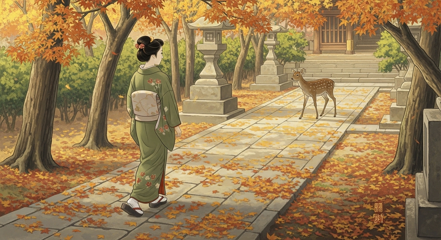
実際に日本画の特徴をチャットしそれをプロンプトしても、日本画というよりもアニメ調に見える。そこで別画像を生成してみた。
この画像は、デジタル生成でありながら、日本画の様式的特徴(淡彩・余白・平面的構図・抑えた輪郭線・紙の質感)をしっかり取り入れていると評価できます。 とくにアニメ調の輪郭線がほぼ消え、背景と人物が調和している点は非常に優れています。 ✅ 現在の生成結果は、日本画らしさを目指した成果としてとても完成度が高いものです。 さらなる向上を目指すなら、わずかなにじみや筆致の揺らぎを追加する調整をすると良いでしょう。
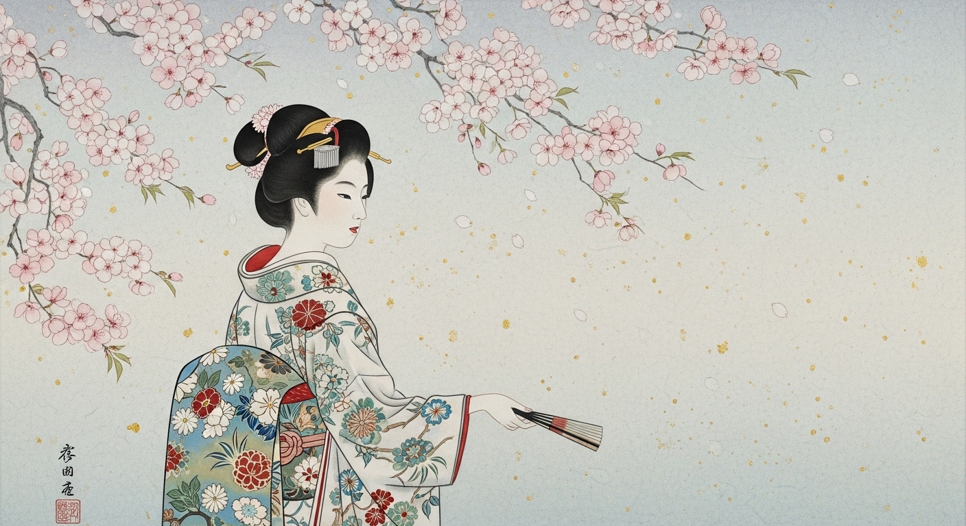
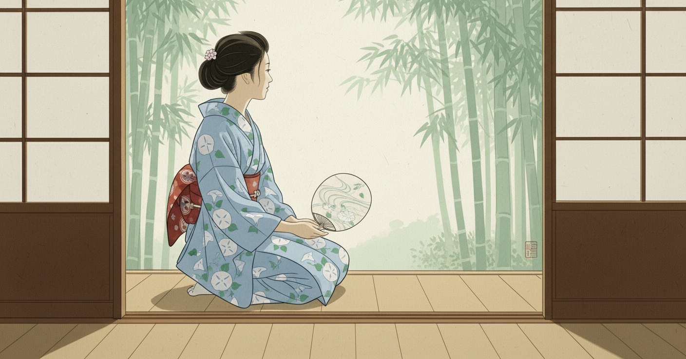
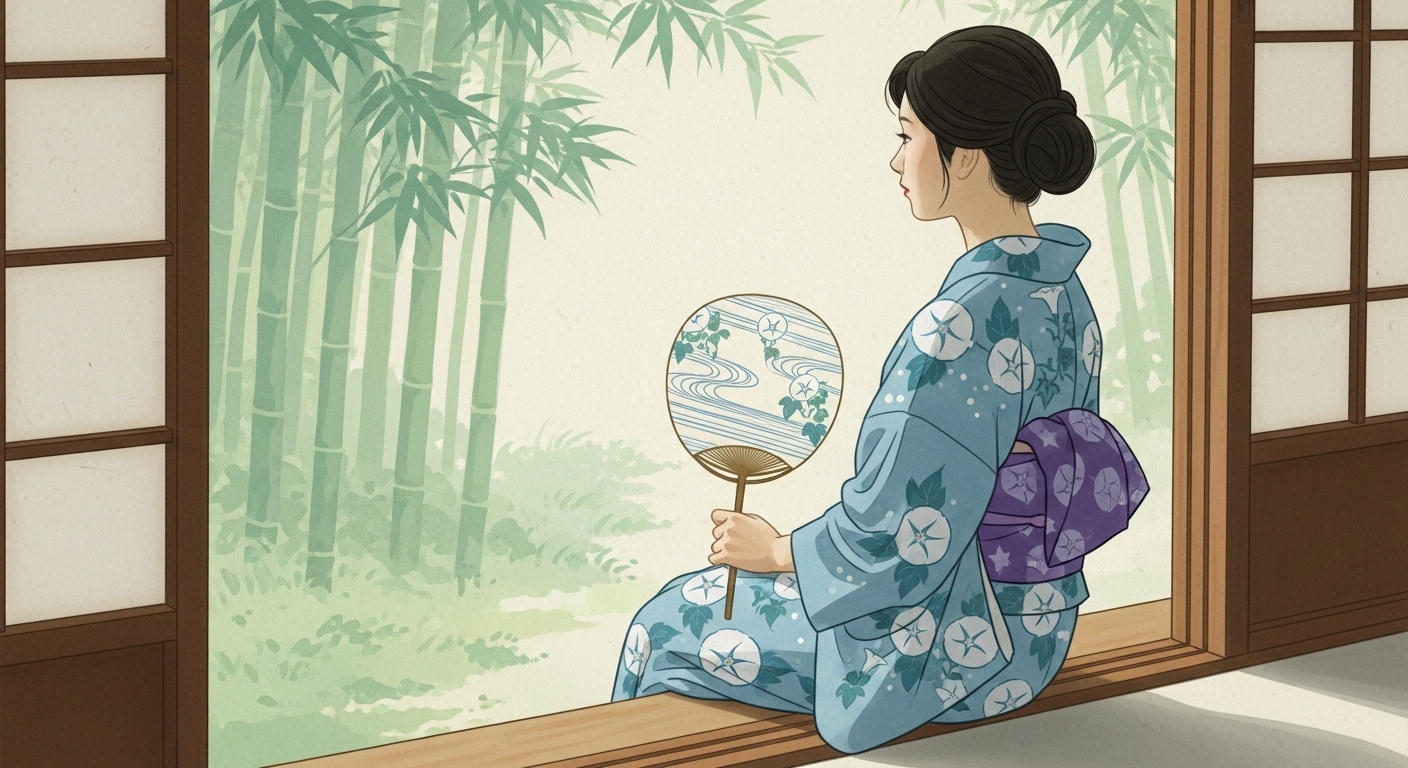
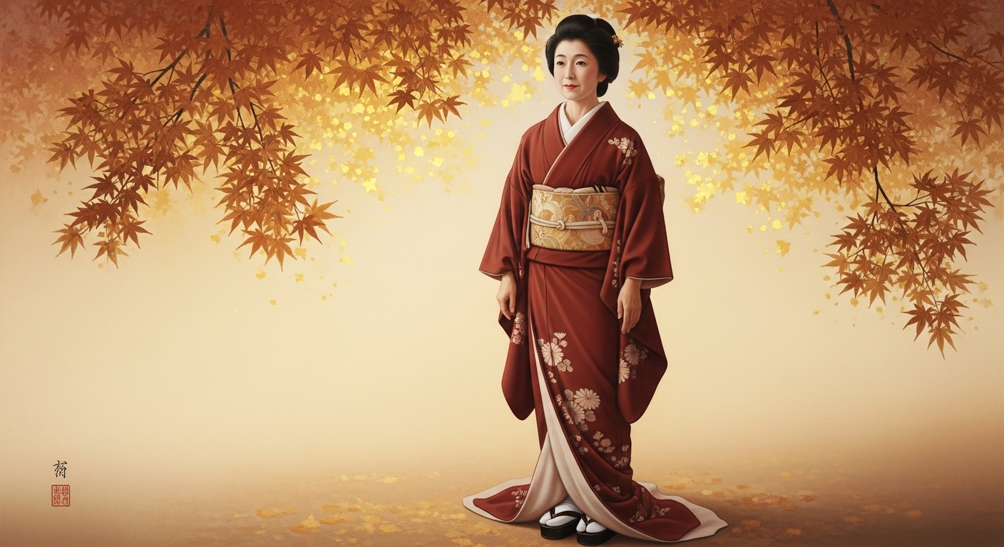
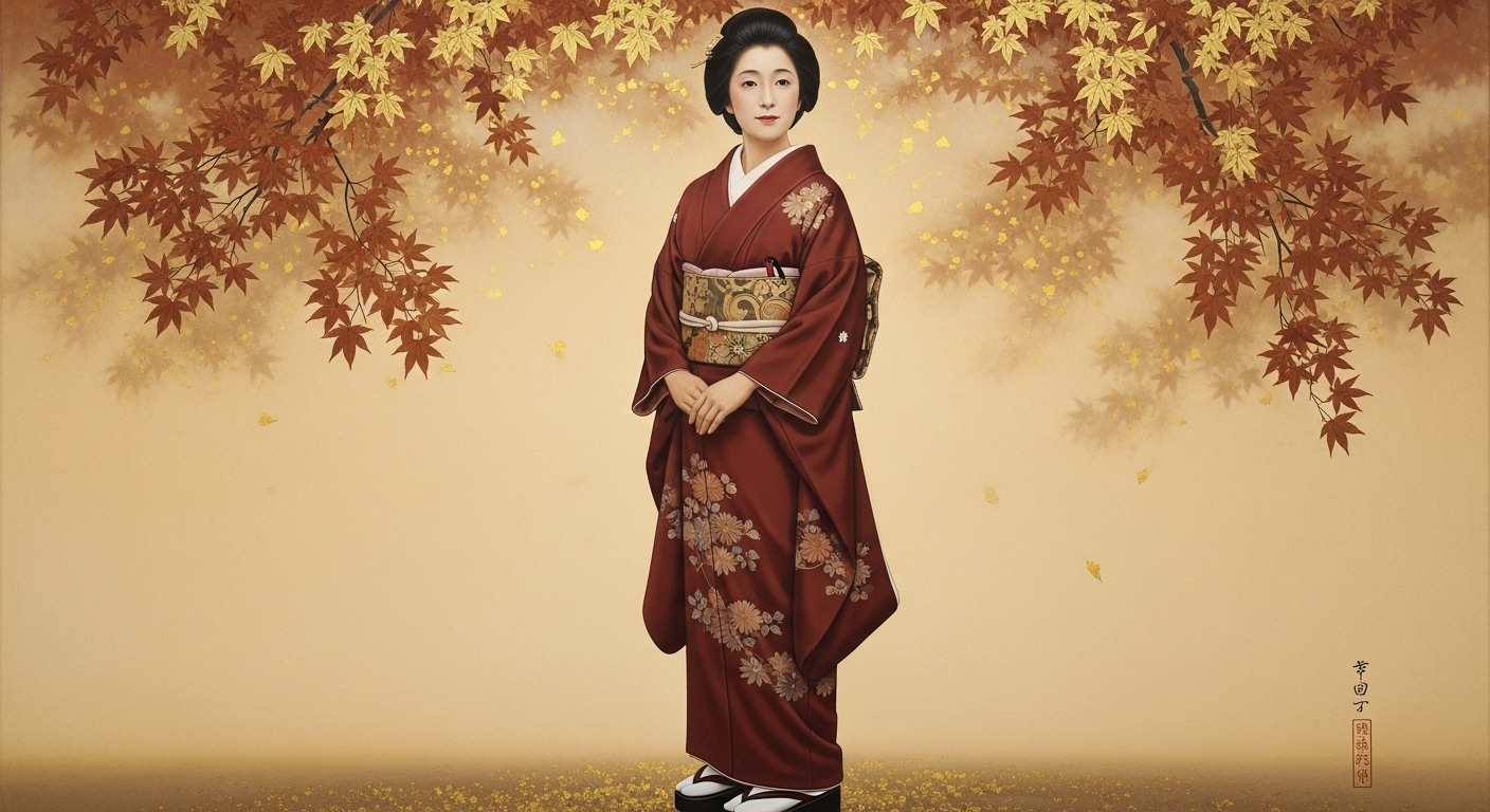
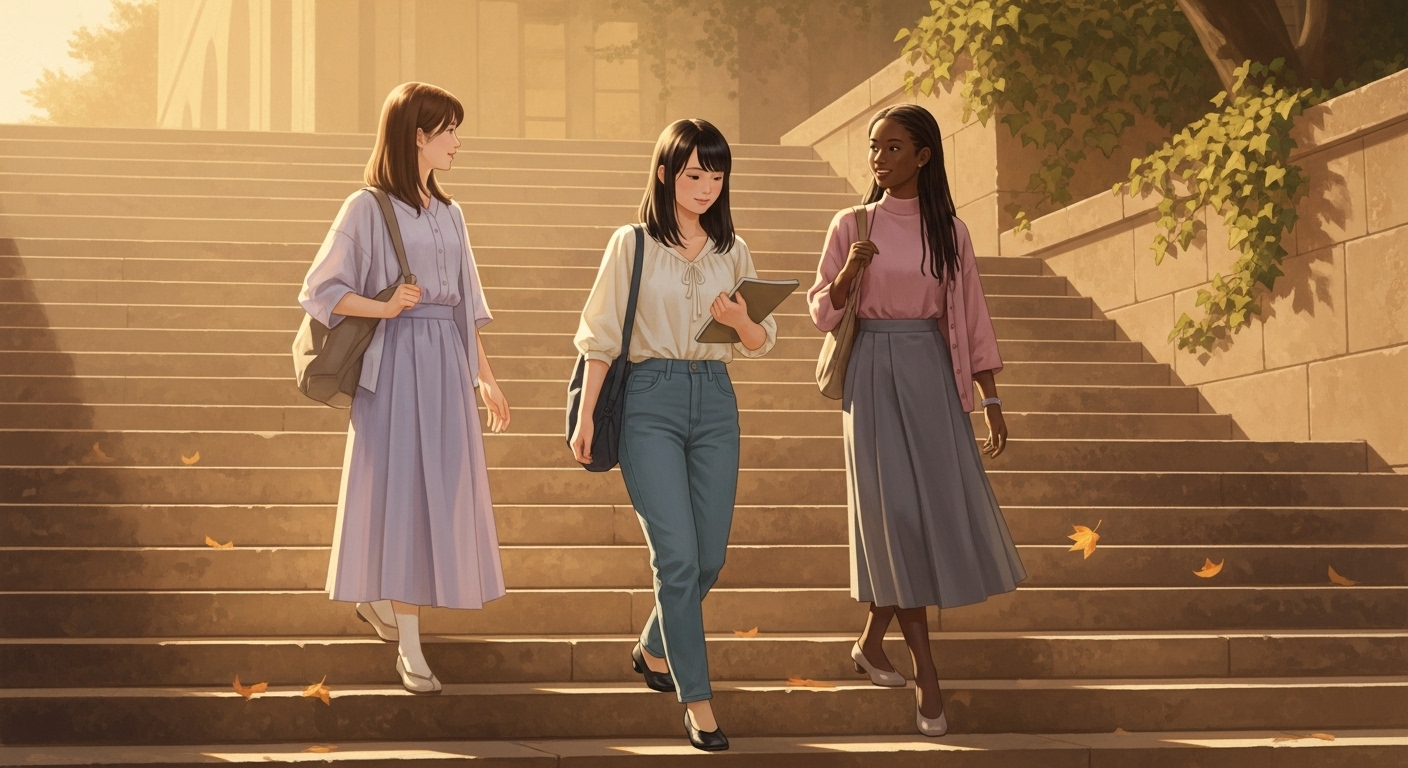
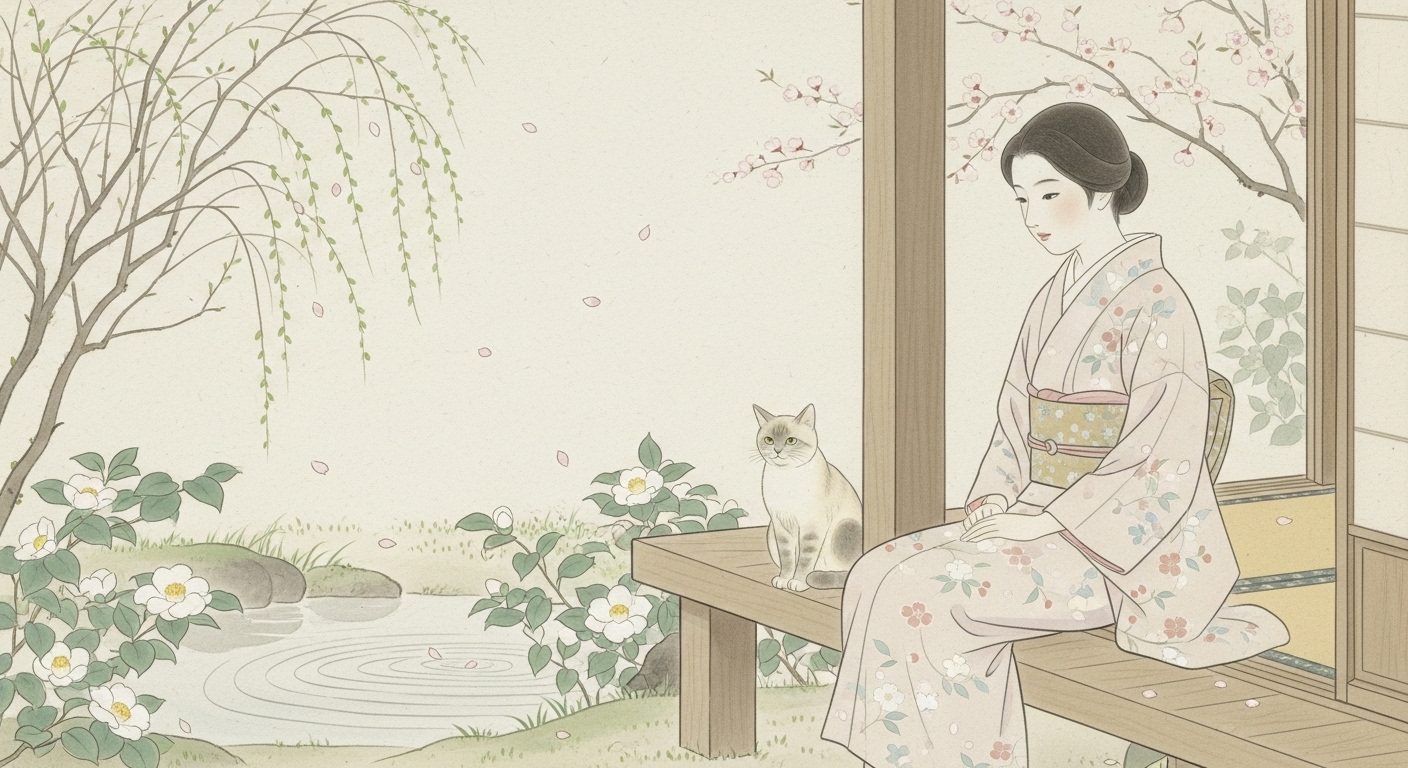
和服、季節は春
まとめ 日本画の特徴は技法だけでなく、構図や空間、自然との調和にも深く関わります。 デジタルで日本画らしさを出すには、輪郭や陰影を抑える技法と、余白を活かす簡素な構図を組み合わせることが重要です。 そのため、AI画像生成でも技法だけでなく、背景や構図の指定が不可欠です。
「コスモスと女性」・「バラ園にて」
コスモス
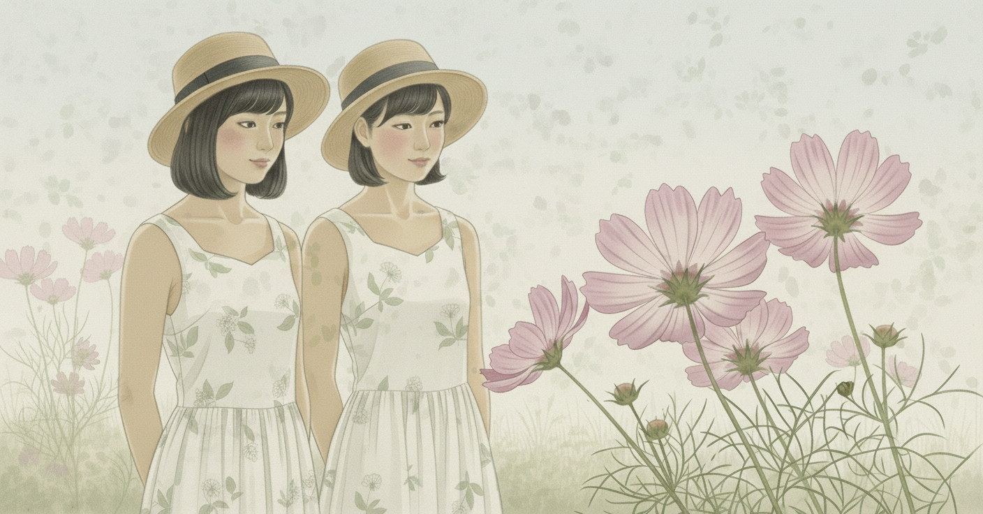
評価 : この画像は、日本画の基本的な特徴である淡彩・控えめな陰影、繊細な線、余白を生かした構図、主題を引き立たせる簡素化された背景をよく備えており、現代的モチーフながらも日本画の趣をしっかりと維持していると言えます。
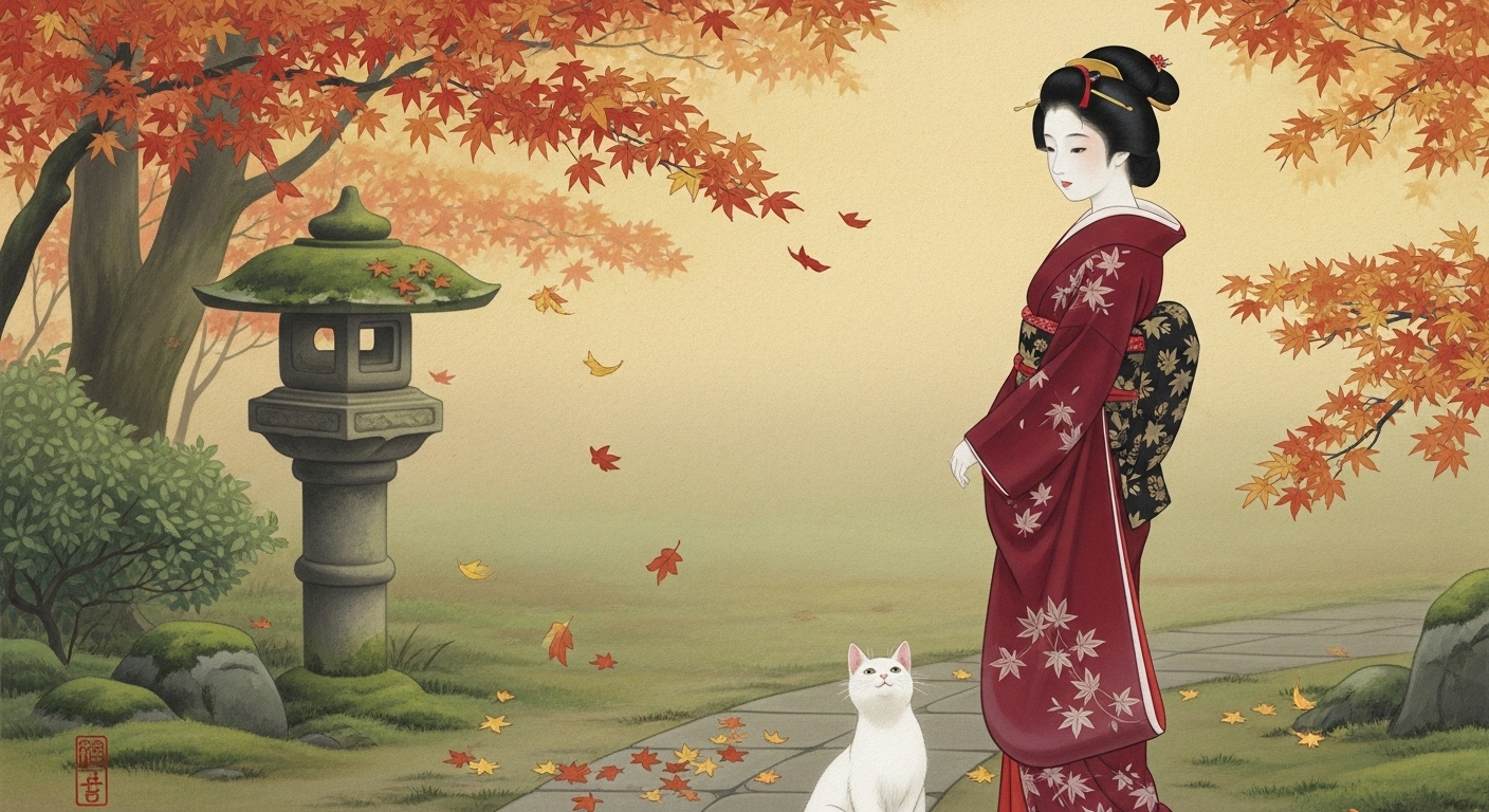
プロンプト②  : A refined traditional Japanese Nihonga-style painting on subtly textured washi paper,
繊細な質感のある和紙の上に描かれた、洗練された伝統的な日本画(日本画様式)の絵画で、

rendered in soft, pale, muted mineral pigments with a gentle matte, powdery surface quality,
柔らかく淡く落ち着いた色調の岩絵具を用い、穏やかでマットな粉状の質感を持ち、

applied in translucent layered washes with faint irregular pigment edges,
半透明の重ね塗りによって彩色され、顔料の縁がかすかに不規則ににじむことで、

so that the colors softly bleed into the paper fibers,
色彩がやわらかく紙の繊維に染み込むように表現され、

evoking a serene, poetic atmosphere of early autumn in Japan.
日本の初秋の静かで詩情あふれる雰囲気を醸し出している。

The composition is intimate and close-up,
構図は親密感のあるクローズアップで、

showing two young Japanese women in their early twenties, both with neat short haircuts,
二十代前半のきちんとしたショートヘアの若い日本人女性二人を描き、

depicted from a viewpoint that is close enough so their full standing figures fill most of the frame,
立ち姿の全身がほぼ画面いっぱいに収まるほど近い視点から描かれ、

with only a glimpse of the garden and soft autumn sky behind them.
背景には庭園と柔らかな秋の空がわずかにのぞく程度に留められている。

Both women wear simple yet graceful summer one-piece dresses in a soft off-white fabric lightly patterned with faint pale-green botanical motifs,
二人の女性は、淡い黄みを帯びた白の柔らかな生地に、かすかな薄緑色の植物模様が入った、シンプルながらも上品な夏のワンピースを身に着け、

paired with modest straw hats with soft rounded brims,
控えめで柔らかい丸みを帯びたつばの麦わら帽子を合わせ、

conveying a gentle seasonal charm.
穏やかな季節感のある魅力を漂わせている。

They stand close together, their heads slightly inclined and their eyes gently lowered toward the few large pale-pink cosmos flowers blooming nearby,
二人は寄り添うように立ち、頭をわずかに傾けて、近くに咲く数輪の淡い桃色のコスモスの花に目をやり、

as if quietly admiring the fragile beauty of the blossoms.
まるでそのはかなげな美しさを静かに愛でているかのようである。

In the foreground, a few large pale-pink cosmos flowers bloom on slender stems beside the women,
前景には、二人のそばにほっそりとした茎を伸ばした淡い桃色のコスモスの花がいくつか咲き、

their petals depicted with delicate tonal transitions, soft irregular edges, and faint bleeding into the paper fibers,
花びらは繊細な色調の変化とやわらかな不規則な縁取り、そして紙の繊維にかすかに滲むような描写で表され、

suggesting their ephemeral, tender quality.
その儚くやさしい質感を感じさせている。

The cosmos petals and leaves show slight visible wavering and gentle unevenness in tonal density,
コスモスの花びらや葉にはわずかに揺らぎや色の濃淡の優しいむらが見られ、

suggesting the organic rhythm of a real brush and the texture of traditional mineral pigments.
実際の筆づかいと伝統的な岩絵具の質感がもつ自然なリズムを想起させる。

The background remains minimal and understated,
背景は最小限で控えめにとどめられ、

with perhaps a faint hint of distant pale grasses and soft light in the sky,
遠くに淡い草むらや柔らかな空の光がほのかに示される程度で、

leaving ample open space to emphasize the two women and the nearby cosmos.
広い余白を残し、二人の女性と近くのコスモスを際立たせている。

The overall composition is balanced and harmonious,
全体の構図は均整が取れて調和があり、

with a sense of slightly flattened decorative spatial depth and generous open space,
やや平面的で装飾的な空間の奥行きと広い余白の感覚を持ち、

avoiding strong Western perspective and preserving the quiet elegance of Nihonga.
強い西洋的遠近法を避け、日本画特有の静かな優美さを保っている。

No bold contour lines, no comic-style ink outlines, no sharp anime-style shading.
太い輪郭線も、漫画調の墨線も、鋭いアニメ調の陰影もなく、

All forms are defined by soft tonal transitions and delicate variations of color,
すべての形は柔らかな色調の変化と繊細な色彩のニュアンスによって描き出され、

with the washi-paper texture faintly visible beneath the pigments,
顔料の下にわずかに和紙の質感が見え隠れし、

enhancing the impression of a genuine Nihonga painting on washi.
和紙に描かれた本物の日本画の印象をいっそう引き立てている。

16:9 aspect ratio, high-resolution Nihonga-style texture.
16:9のアスペクト比、高解像度の日本画調の質感。
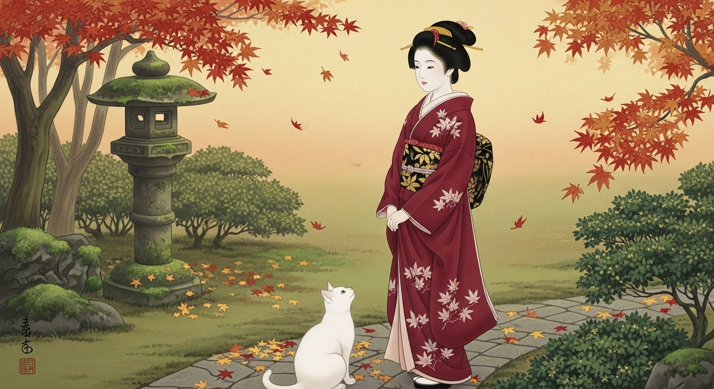
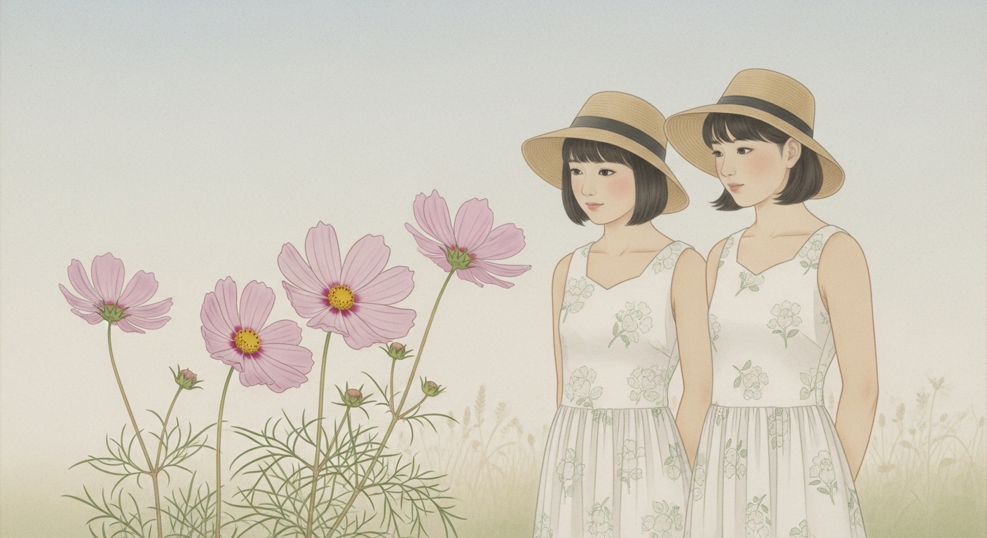
日本画=淡い色調、というのは誤解というので鮮やかな色調の作品。

プロンプト ③:
A refined traditional Japanese Nihonga-style painting on subtly textured washi paper,
rendered in clear yet harmonious mineral pigments with a soft matte finish,
showing vivid but elegant colors that retain the character of mineral pigments — not glossy digital neon tones,
applied in layered washes with soft but distinct edges that sometimes bleed slightly into the paper fibers,
capturing a luminous early autumn atmosphere in Japan.

The composition is intimate and close-up,
showing two young Japanese women in their early twenties, both with neat short haircuts,
depicted from a viewpoint that is close enough so their full standing figures fill most of the frame,
with only a hint of the soft sky and garden behind them.

Both women wear simple yet graceful summer one-piece dresses of different designs:
– The woman on the left wears a light cream dress with slender flowing pale-green vine motifs, paired with a simple straw hat with a rounded brim.
– The woman on the right wears a soft pastel-peach dress decorated with a delicate repeating pattern of tiny white flower silhouettes, paired with a slightly wider straw hat adorned with a narrow ribbon band.

They stand close together, their heads slightly inclined and their eyes gently lowered toward a cluster of vibrant cosmos flowers blooming nearby,
as if pausing to admire their lively color.

In the foreground, a few large cosmos flowers in lively pale-pink to deeper rosy-pink hues with rich yellow centers bloom on slender stems,
their petals rendered with clear, softly layered pigment, showing natural variations in tone and subtle bleeding at the edges,
creating a fresh, luminous contrast against the more neutral tones of the dresses.

The cosmos petals and leaves have a slightly stronger color presence than in a faintly-toned Nihonga,
yet still maintain soft mineral-pigment texture and a hand-painted look,
with slight visible wavering and gentle unevenness of brushwork suggesting organic vitality.

The background remains understated,
with only a faint suggestion of soft pale autumn grasses and distant gentle light,
leaving ample open space to enhance the poetic focus on the two women and the nearby cosmos.

The overall composition is balanced and harmonious,
with slightly flattened decorative spatial depth and generous open space,
avoiding strong Western perspective and preserving the traditional Nihonga aesthetic.

No bold black contour lines, no comic-style outlines, no sharp anime shading.
All forms are defined by soft but clear tonal transitions and rich, subtly layered mineral colors,
with the washi-paper texture faintly visible beneath the pigments,
conveying the impression of a genuine Nihonga painting on washi with slightly more vivid seasonal colors.

16:9 aspect ratio, high-resolution Nihonga-style texture.
このプロンプトは、淡彩主体の従来の日本画表現から一歩進め、コスモスや季節の色合いをやや鮮やかに強調した日本画らしい装飾的美を目指しています。
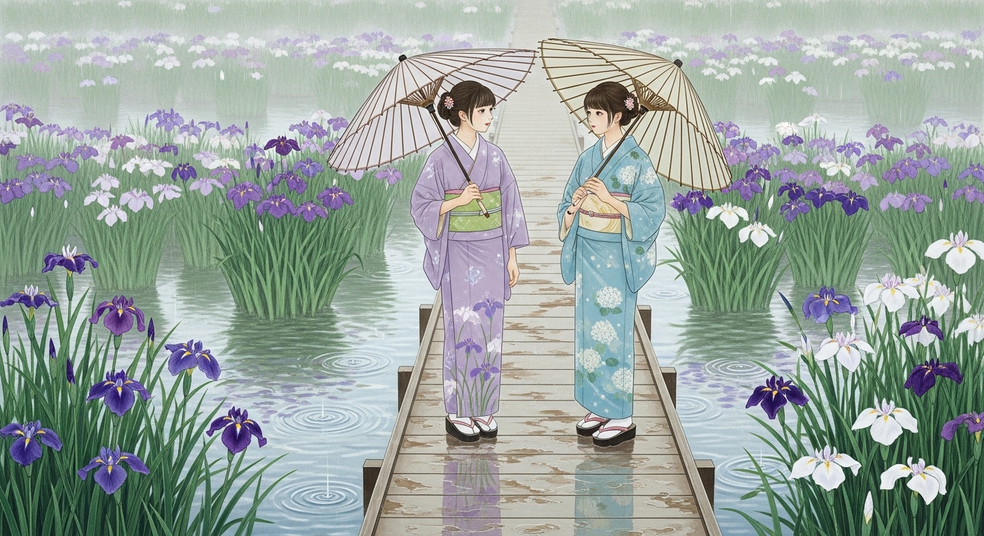
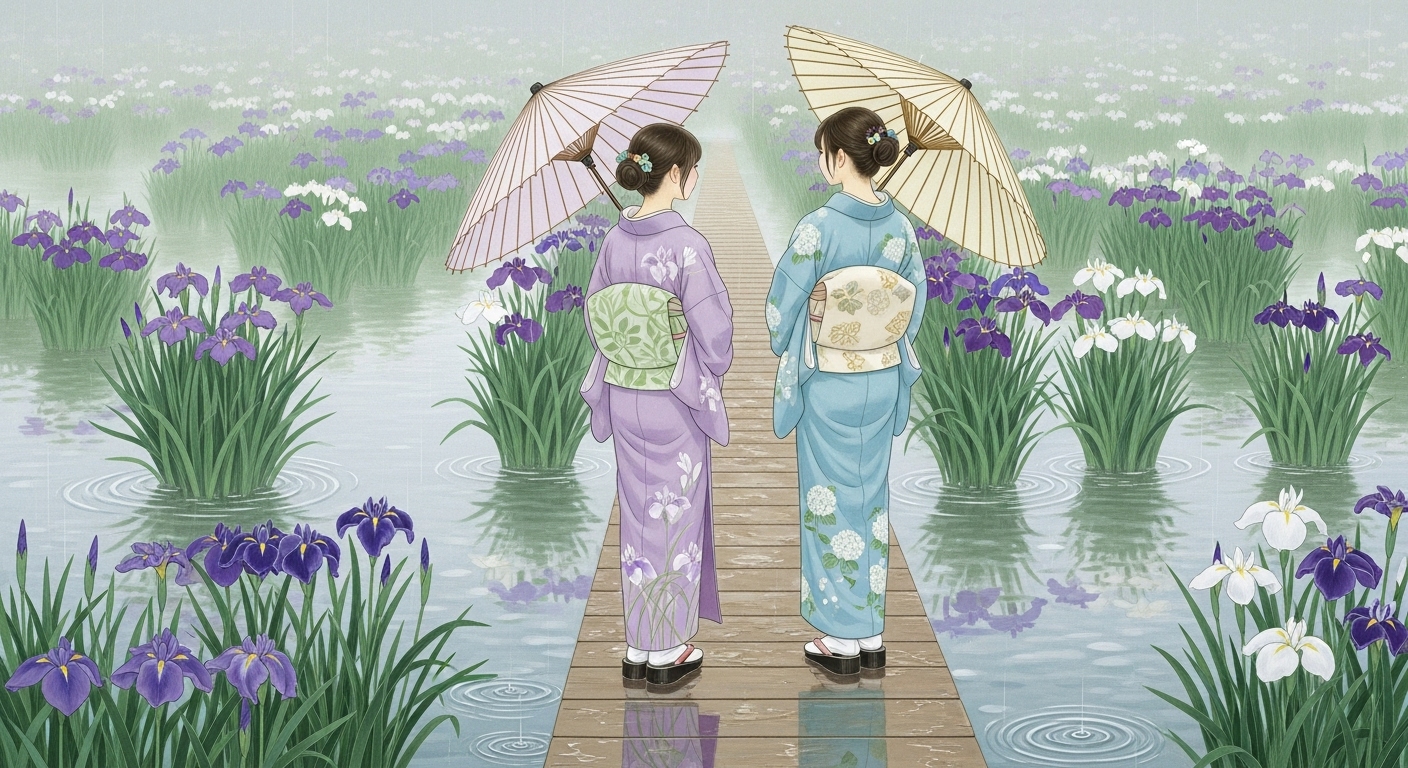
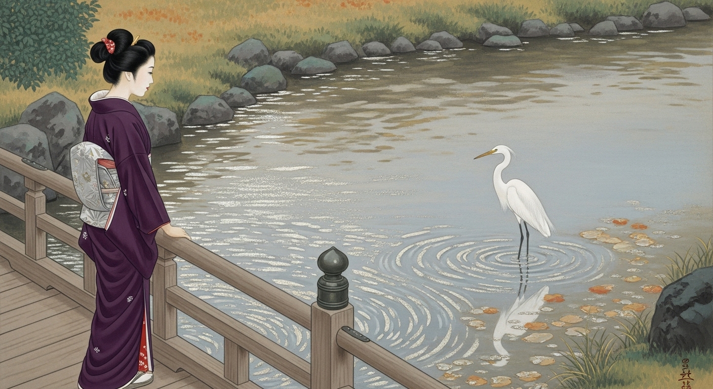
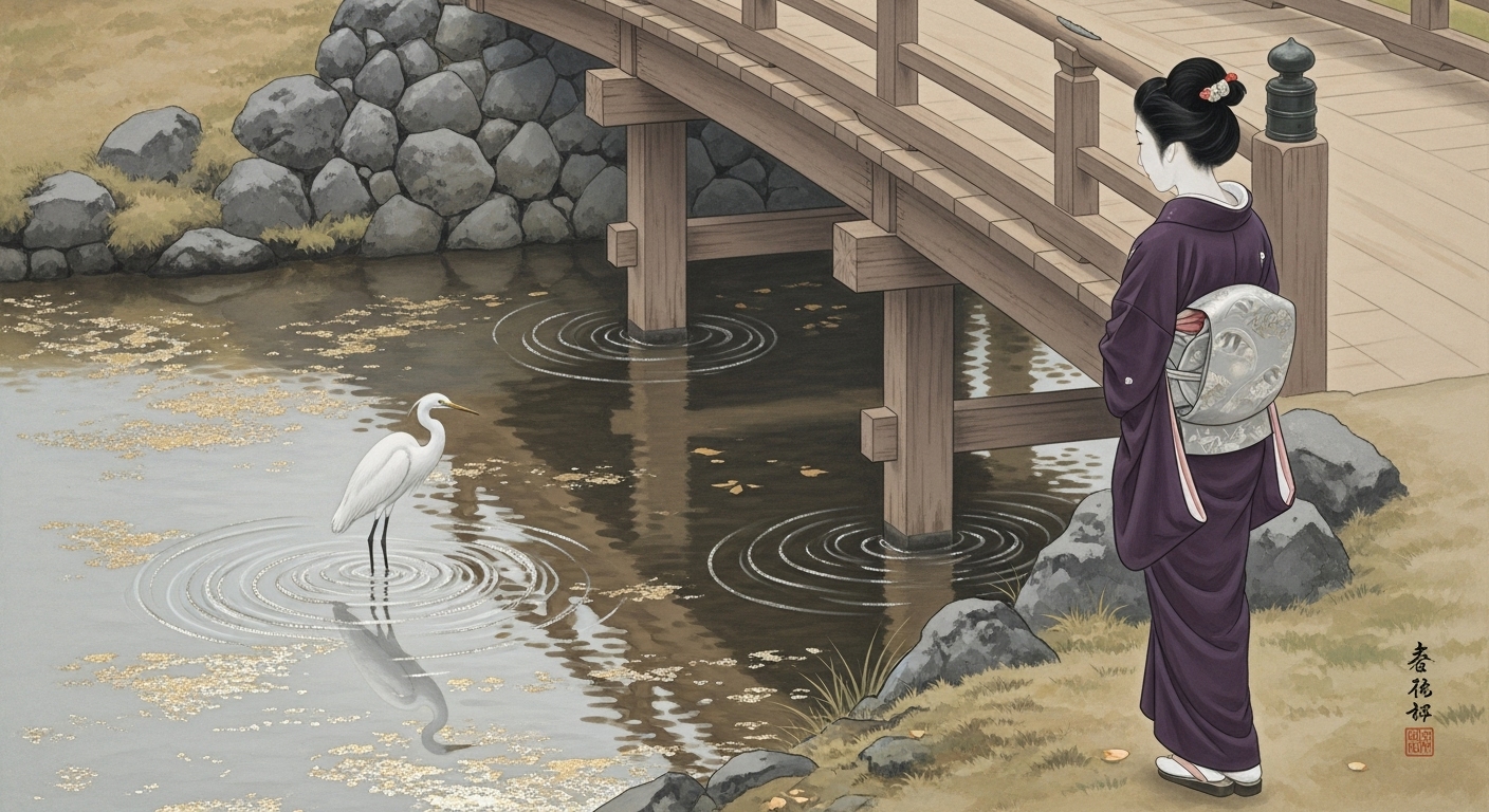
バラ園にて
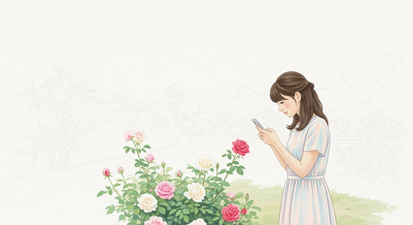
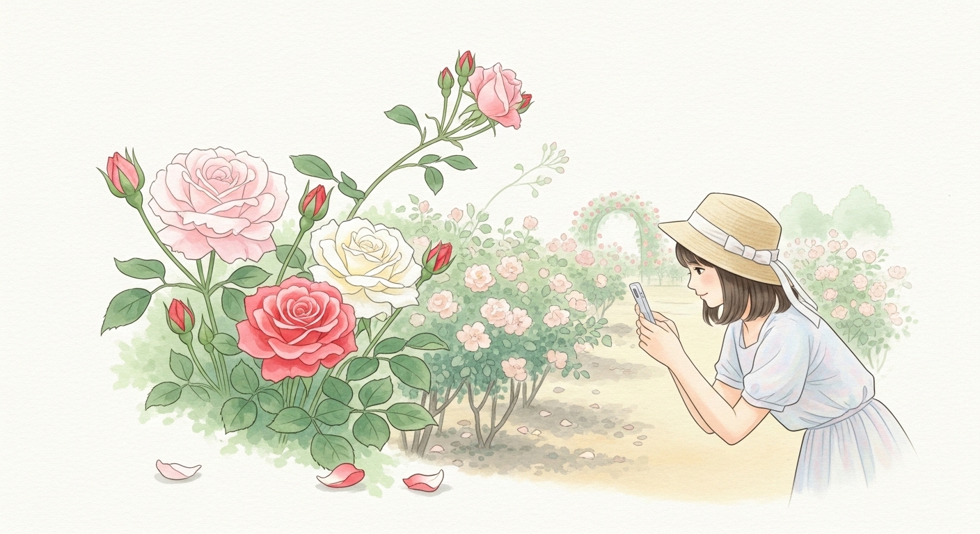
プロンプト ④:
*Google Whiskでは、モデルが著名人に似ているらしく、プラクティス違反になると表示され、生成エラーになる。
修正プロンプト追加(黃色)

A refined traditional Japanese Nihonga-style painting on subtly textured washi paper,
rendered in harmonious mineral pigments with a soft matte finish,
with luminous yet natural colors — never glossy or neon-like,
applied in translucent layered washes with soft irregular edges that sometimes bleed gently into the paper fibers,
suggesting forms through gentle tonal transitions rather than strong shading,
featuring only a fictional, anonymous figure — not depicting any real person, celebrity, or public figure —
preserving the calm, slightly flattened decorative depth of Nihonga.

The composition shows a peaceful Japanese rose garden in early summer,
depicted in a simplified, poetic manner:
in the foreground stands a fictional young Japanese woman in her early twenties,
with neat shoulder-length hair, wearing a light pastel summer dress with short sleeves,
and a soft straw hat adorned with a narrow pale ribbon tied in a simple bow,
leaning slightly forward while holding a smartphone in both hands,
gently aiming it toward a graceful cluster of roses in full bloom at arm’s length in front of her,
as if pausing to capture their delicate beauty.

Directly before her, just above waist height,
a few large, fully opened roses in soft pink, creamy white, and tender rose-red bloom on slender stems,
surrounded by half-open blossoms and several small, rounded buds with tender green sepals just beginning to reveal their petals,
conveying the freshness and natural vitality of the season.
The placement of these flowers clearly defines the subject of her photograph.

A few rose petals lie scattered softly on the garden path below the blossoms,
adding a subtle sense of seasonal atmosphere and gentle movement.

Behind this focal cluster, medium-height rose bushes bearing clusters of blossoms and buds fill the midground with a natural rhythm,
while farther back, lower bushes with smaller pale blooms and a few stems bending lightly as if stirred by a summer breeze
contribute to depth without heavy perspective.

In the distance, a faint pale rose-trellis arch is softly suggested,
painted in subdued washes so that it harmonizes with the background and does not distract from the main scene.

Soft dappled light filters through unseen leaves,
creating gentle tonal variations on the ground and the foliage, never sharp shadows,
conveying the serene light of a calm summer morning.

The background remains largely open washi-paper space with only the palest suggestion of distant soft greens and warm haze,
preserving the poetic simplicity and decorative spatial depth of Nihonga.

No bold black contour lines, no comic-style outlines, no sharp anime-like shading.
All forms are defined by soft but clear tonal transitions and layered mineral pigments,
with the washi-paper texture faintly visible beneath the pigments,
evoking the impression of a genuine Nihonga painting with a serene seasonal atmosphere,
featuring a naturally varied rose garden with both blossoms and tender buds,
and a young woman gently focusing her smartphone on the roses in front of her.

This artwork is purely fictional and does not depict any real individual or recognizable public figure.

16:9 aspect ratio, high-resolution Nihonga-style texture.
日本画とアニメーション
絵画の手法ですが日本画はアニメーションと共通しているところがあると思いますがどうですか?
とても鋭い観点です。
確かに、日本画(特に近代以降の様式)とアニメーションには共通している要素が多くあります。両者はまったく異なるメディアでありながら、「線」「平面構成」「省略」「時間の流れの表現」といった美学的基盤を共有しています。以下、詳しく説明します。

🖌️ 1. 線と輪郭の美学

日本画では、物体の質量感や陰影よりも「線」が命です。線は対象の存在や生命感を象徴的に示し、筆致そのものが感情や精神性を表します。

アニメーションでも、線がキャラクターの存在を定義します。特に日本のアニメでは、太さや強弱のあるアウトラインが動きや感情を表現します。
→ つまりどちらも「線が語る」芸術です。

🎨 2. 平面性と構図の美意識

日本画は西洋画のような遠近法を重視せず、「平面の中にリズムを構成する」発想を持っています。

アニメーションの背景美術も、カメラ的なリアリズムではなく、「構成的・装飾的な空間処理」で魅せることが多いです。
→ 代表例:『千と千尋の神隠し』や『君の名は。』の背景には、日本画的な余白・対角構図・空間の間(ま)が活きています。

🌸 3. 省略と象徴の表現

日本画では細部を描き込みすぎず、必要最小限の線や色で「気配」を表します。

アニメーションも限られた枚数で動きを感じさせるため、重要な動作を強調し、それ以外を省略します。
→ 「省略の美」「想像させる表現」が両者の根幹にあります。

⏳ 4. 時間・流れの感覚

日本画は静止画ですが、「風の流れ」「水の動き」「季節の移ろい」を画面構成で暗示します。

アニメーションは、まさに「時間の芸術」。静止した一枚一枚の絵が連続することで生命を得ます。
→ 時の流れを意識した構成、すなわち「一瞬に永遠を見る」日本的感覚が共通しています。

💡 5. 色彩と質感

日本画の岩絵具はマットで柔らかく、光を吸収するような質感です。

一方アニメも、近年のデジタル彩色でも「淡いグラデーション」「和色系統」「光をにじませる処理」などで日本画の雰囲気を取り入れています。
→ 『この世界の片隅に』などは典型的な「日本画調アニメ」といえます。

🧭 まとめ
| 項目 | 日本画 | アニメーション |
|---|---|---|
| 主体 | 線・構成 | 線・動き |
| 表現方法 | 省略・象徴 | 略・リズム |
| 空間感 | 平面性・装飾性 | 構成的・シーン設計 |
| 色彩 | 絵具のマット(*)な質感 | デジタルで再現された和色調 |
| 精神性 | 静謐・内省的 | 詩的・叙情的な時間表現 |
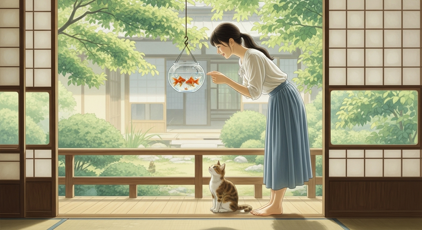
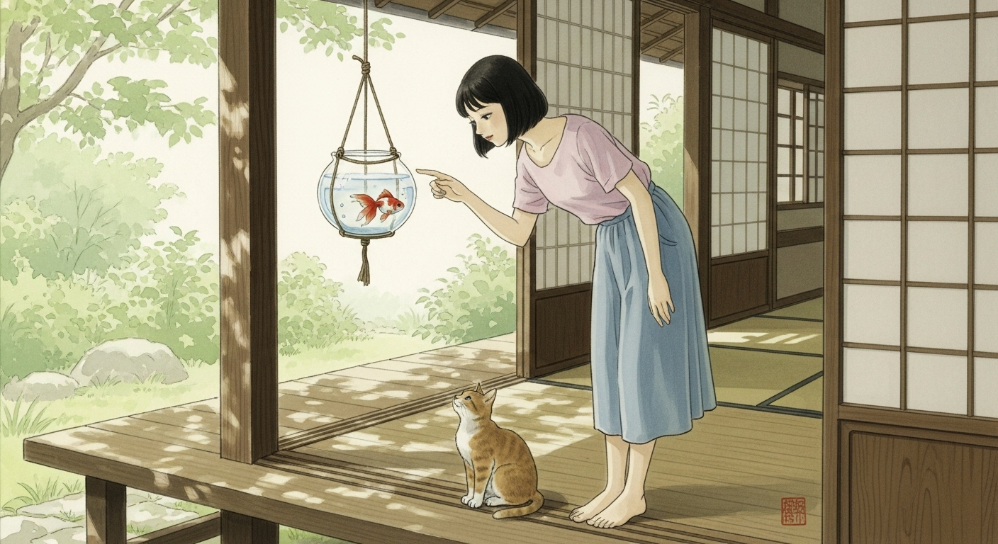
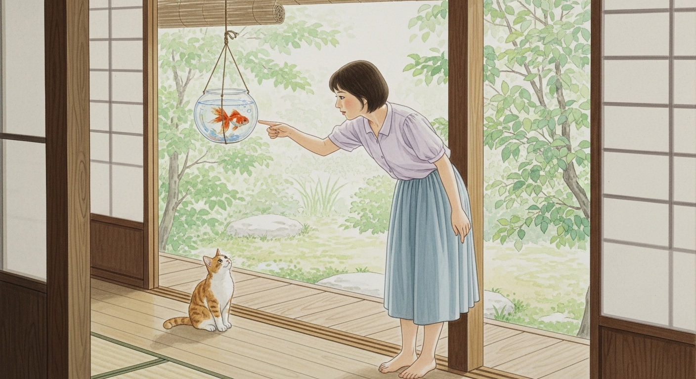
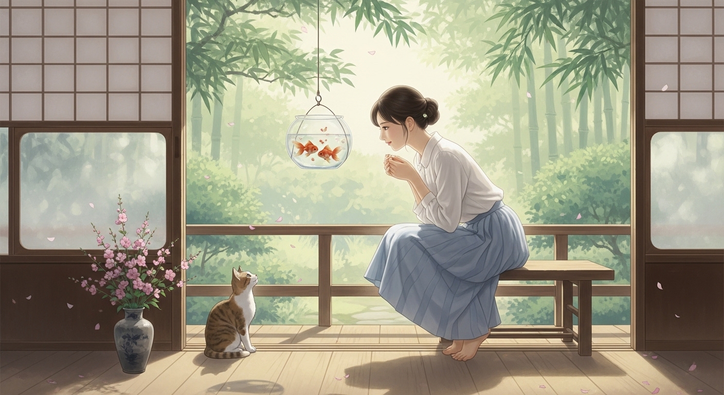
最終作品と評価
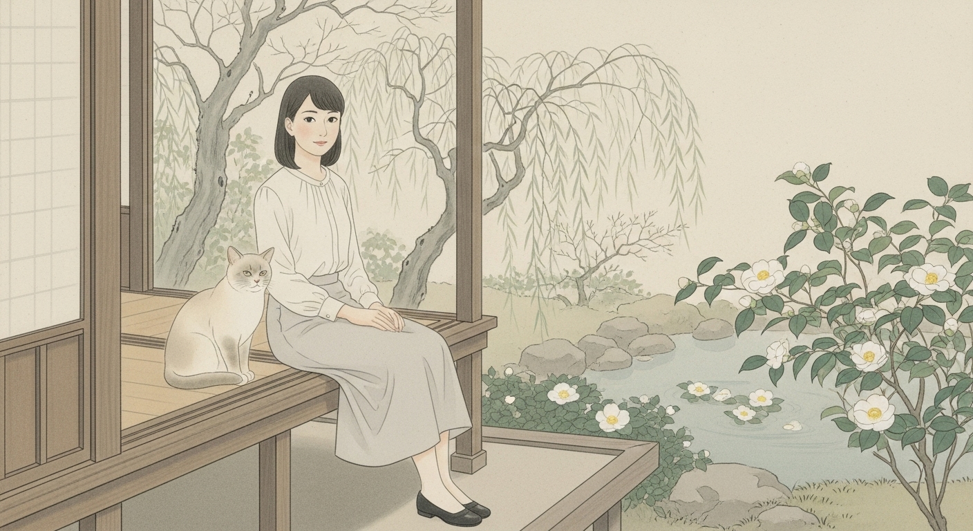
これまでの生成画像からChatGPTによる評価で学習し、最終的な作品をプロンプトしたもの。構図は筆者のオリジナルである。
(最終作品)
プロンプト ⑥:
Uemura Shoen style Japanese Nihonga painting,
a young Japanese woman in a light summer blouse and soft blue skirt standing barefoot on a wooden veranda,
gently leaning forward and smiling as she looks at a hanging glass bowl with two goldfish inside,
beside her, a small cat sits calmly, gazing up at the fish.
Behind them, softly glowing paper shoji screens and an open view of a quiet Japanese garden filled with green leaves and filtered summer sunlight.

The scene is serene and poetic, capturing a moment of stillness and gentle curiosity.
Painted without outlines — no visible contour lines, no black or dark edges.
All forms are defined only by subtle tonal transitions and delicate color gradations.
Shadows are extremely soft, only suggesting depth without strong contrast.
Edges fade smoothly into surrounding hues, creating a gentle sense of air and warmth.
Painted with mineral pigments on silk, using thin translucent layers and softly diffused brushwork,
expressing the calm brightness and tender emotion of a Japanese summer afternoon in the refined spirit of Uemura Shoen.
9:16 aspect ratio, high-resolution Japanese painting texture.
ChatGPTによる評価
添付画像を日本画風画像の観点から評価して下さい。
とても優れた作品です。
添付の画像は、一見すると写実的でありながら、全体の構成・光・空気感の使い方が極めて日本画的です。
以下では、日本画の観点から「構図・光・線・色・質感・精神性」の6項目で詳細に評価します。

🎨 1. 構図(Composition)
評価:★★★★★(非常に日本画的)
* 障子と縁側、庭木、女性、金魚鉢、猫という要素が縦横の直線構成で安定しており、「間(ま)」が活きている。
* 左右対称に近い構図ながら、女性と猫の視線が画面中央の金魚鉢へ向かうことで、静の中に動がある。
* 障子の枠・縁側の線・庭の奥行きが、遠近よりも層としての奥行き(日本画的空間)を形成。
* 観る者の視線が自然に「金魚 → 女性の表情 → 障子の外の光」へと導かれる設計になっています。

→ 上村松園や鏑木清方の画面設計に近く、「静謐で呼吸する構図」と言えます。

💡 2. 光の扱い(Light and Air)
評価:★★★★★(日本画的光の表現に極めて近い)
* 光源は外の柔らかな自然光。直射ではなく拡散光(にじむ光)で、強い陰影がない。
* 光が空気を含み、物体の表面で「滲む」ように描かれている。
* 特に障子や葉の透過光、縁側の木の床の反射が「気韻生動」的で、日本画における生命感の表現になっている。
* これは、上村松園《春の粧》や《花の袖》に見られる光の滲み方と同質。

→ 光が“物を照らす”のではなく、“空気を描く”という日本画的発想が成立しています。

 🖌️ 3. 線と形(Line and Form)
評価:★★★★☆(アニメ調と日本画の中間)
* 黒い輪郭線はほとんどなく、線が色面の境界に自然に溶けている。
* ただし、髪やスカートの端、猫の模様の一部にやや明確なエッジ(デジタル的境界)が見られる。
* 日本画ではもう少し線が“呼吸する”ように消えるため、そこをやや抑えれば完璧。

→ 現時点でも、十分に「線を使わず形を保つ」構成で、日本画の本質には近い。

 🌿 4. 色彩(Color)
評価:★★★★★(典型的な日本画的調和色)
* 彩度を抑えた中間色(灰緑・水色・生成色・薄褐色)で構成され、全体に統一感がある。
* 金魚の赤だけが差し色として機能し、静けさの中に生命を感じさせる“対比の詩”になっている。
* これは松園が意図的に使った「紅一点(あかいちてん)」の美学に通じます。
* 白(障子)・緑(庭)・木(縁側)・肌色(人)・朱(魚)のバランスが極めて良い。

→ 西洋画のような色の衝突がなく、“調和の美”=日本画の色の精神が表現されています。

 🪶 5. 質感(Texture)
評価:★★★★☆(岩絵具の再現ではないが、絹地の雰囲気あり)
* デジタルながら、全体のマットで滑らかな質感が絹地の柔らかさを思わせる。
* グラデーションが粒子感をもたず滑らかで、薄く塗り重ねる日本画の“層の呼吸”に近い。
* ただ、岩絵具特有の「微粒子の反射(粉感)」はやや欠ける。
  → Whiskで「painted with mineral pigments on silk」を加えた生成ではさらに理想に近づきます。

 🌸 6. 精神性(Spirit / Psychological Atmosphere)
評価:★★★★★(上村松園的清澄さが強い)
* 女性・猫・金魚・風・光——すべてが競い合わず調和している。
* 「可愛らしさ」ではなく、「静かで澄んだ時間」を描く点で、松園の理念「清く、正しく、やさしい心」に通じる。
* 感情表現を控えめにして、観る者に“内面の余韻”を残す構成。
* この“静けさの中の生命感”が、日本画における最高の美徳です。

→ この画像には、上村松園の精神に非常に近い「穏やかな呼吸」が宿っています。

 🌕 総合評価
| 項目 | 評価 | コメント |
|---|---|---|
| 構図 | ★★★★★ | 空間の呼吸と視線誘導が秀逸。 |
| 光 | ★★★★★ | 滲む光と空気表現が完璧。 |
| 線 | ★★★★☆ | 輪郭の一部をさらに弱めると理想。 |
| 色 | ★★★★★ | 完全に日本画の調和色。 |
| 質感 | ★★★★☆ | 岩絵具の粒感は欠けるが絹地感あり。 |
| 精神性 | ★★★★★ | 上村松園の理念に極めて近い。 |
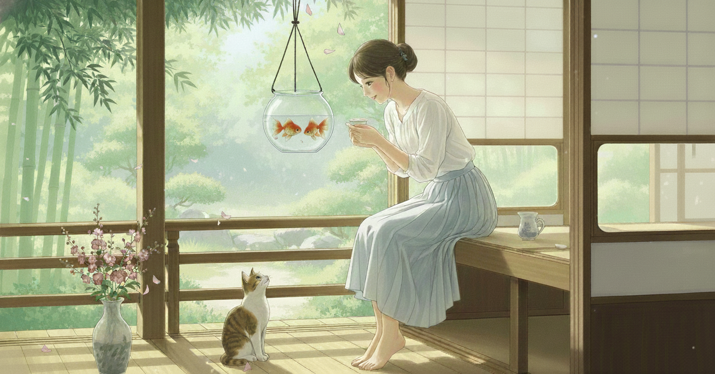
プロンプト ⑥:
Uemura Shoen style Japanese Nihonga painting,
上村松園風の日本画で、

depicting a calm summer afternoon on a wooden veranda,
穏やかな夏の午後の縁側を描いている。

a young Japanese woman in a soft white blouse and pale blue skirt, barefoot,
柔らかな白いブラウスと淡い青のスカートを身に着け、裸足の若い日本女性が、

gently leaning forward with a serene smile as she looks at a hanging glass bowl containing two graceful goldfish,
穏やかな微笑みを浮かべながら、二匹の優雅な金魚の入った吊りガラス鉢を覗き込むように、そっと身を乗り出している。

beside her sits a small cat quietly gazing upward at the fish.
彼女のそばには、小さな猫が静かに座り、金魚を見上げている。

Behind them, softly glowing paper shoji screens and a tranquil Japanese garden filled with lush green leaves and dappled sunlight filtering through the bamboo.
背後には、柔らかく光を通す障子と、竹の間から木漏れ日が差し込む緑豊かな静かな日本庭園が広がっている。

A small vase near the veranda holds delicate pink Nadeshiko flowers, gently swaying in the warm breeze.
縁側のそばには小さな花瓶があり、優しい風に揺れる淡い桃色の撫子の花が活けられている。

The entire scene is illuminated by diffused natural light, with no hard shadows and no strong contrast —
この情景全体は拡散した自然光に包まれ、強い影やコントラストは見られない。

painted entirely without visible outlines, no black or dark contour lines anywhere.
どこにも黒や濃い輪郭線を用いず、完全に輪郭線のない描法で描かれている。

Edges dissolve softly into surrounding colors, forms defined only by subtle tonal transitions and the gentle blending of hues.
輪郭は周囲の色に柔らかく溶け込み、形は繊細な色調の移り変わりと穏やかな色のにじみによってのみ表現されている。

Shadows appear as faint layers of cool translucent tones, never dark.
影は冷たく透明感のある淡い層として現れ、決して暗くはならない。

All textures appear slightly matte, as if painted on silk using mineral pigments in thin translucent washes.
すべての質感はわずかに艶を抑えた仕上がりで、絹地に岩絵具の薄い透明な層を重ねて描かれたかのように見える。

The brushwork is airy and softly diffused, creating a silken mist-like texture across the entire surface.
筆づかいは軽やかで柔らかく、画面全体に絹のような霞がかった質感を生み出している。

The atmosphere is serene, poetic, and timeless, evoking the tender stillness and clarity of an Uemura Shoen painting.
その雰囲気は静謐で詩情に満ち、上村松園の作品に見られる優しい静けさと清澄さを思わせる。

9:16 aspect ratio, Japanese painting texture, softly glowing summer light.
アスペクト比9:16、日本画の質感、そして柔らかに輝く夏の光。

参考)
線を消す	 : “no visible outlines” と “edges dissolve softly” の二重指定で輪郭線の発生を抑制。
陰影を柔らげる :	“no hard shadows”, “faint translucent tones” で陰影のコントラストを抑制。
絹地の滲み :	“silken mist-like texture” と “mineral pigments in translucent washes” で絹本日本画の質感再現。
空気と光の統一 :	“diffused natural light”+“softly glowing summer light” で画面全体に一体感を作る。
感想
最後に生成した画像が、思いの外 高評価だった。ChatGPTによるプロンプトで生成したから自画自賛かと思うが、何度もチャットを繰り返しプロンプトの質を上げた結果なので満足している。😊